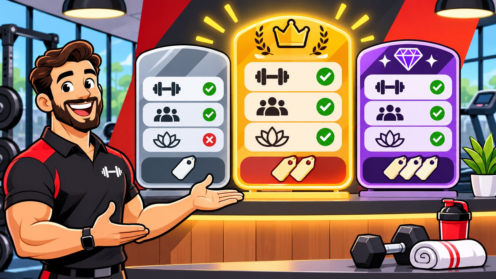
Package design brings together structure, materials, graphics, labeling, and usability to protect an offer and make it easier to choose. A gym's membership menu is part of that system, whether it's a tier sheet on the counter or a welcome kit in a member's hands.
A tier sheet works like a retail box: it holds an offer and shows what's inside. If the names, benefits, and included services are hard to scan, prospects may ask the same questions at the desk instead of comparing options. Clear design helps each tier stand out and makes the choice easier during a rushed visit.
Apply the same thinking to the physical kit and the membership menu. A readable rate card and a clearly labeled kit give members a consistent picture of what they're buying. Gym Membership Tips can help with the next pass on packaging and enrollment scripts once a gym's menu is live.
What Package Design Means at the Front Desk
One sentence you can teach the front desk by Friday: package design is the planned combination of container, structure, materials, graphics, typography, color, logo, layout, labeling, and how easily the thing opens and reads. That's the working answer to what is package design, and it covers a corrugated box and a laminated rate card equally well.

The definition does two jobs at once. It holds what you sell, and it tells a person what the offer means before a salesperson says a word.
Shoppers back up that second job. In a consumer survey reported in a journal article on packaging and buying behavior, 77.8% of respondents agreed that package design influences product choice during purchase, a total made up of 58.0% who agreed and 19.8% who strongly agreed. Only 6.9% disagreed or strongly disagreed, including 5.9% who disagreed and 1.0% who strongly disagreed. Read that as reported perception rather than proof that artwork alone closes sales, and the point still lands: the visual layer does work before anyone speaks.
The membership is the thing inside the box
Members don't buy vague access. They buy a named package they can point at on a wall, a phone screen, or a welcome card. Every part of the definition has a desk job:
- Tier name: the label someone repeats to a friend, so keep it to two words.
- Price and billing cycle: one number, with monthly or paid-up-front written directly beside it.
- Benefit list: the items a member would notice if you removed them.
- Limits: freeze rules, guest passes, and cancellation notice, printed where they can't be missed.
- The skin: the printed card, the PDF, and the poster, all wearing the same colors and type.
Miss that last one and you get a wall chart in one typeface, a welcome email in another, and a referral card that looks like a different business entirely.
Desk test: hand a stranger your rate card for ten seconds, take it back, and ask what the cheapest option includes. If they can't answer, the package failed, not the reader.
Before you open the design software, write one sentence for the offer to feature first. Something like: most new members start on Plus at 69 dollars a month because it covers unlimited classes and a guest pass. That sentence becomes the center of the board, the top of the website, and the first thing staff say.
How a Package Protects and Speaks at Once
A 2025 peer-reviewed study of 490 tea-bag buyers found that four visual elements, color, graphics, logo, and layout, significantly influenced purchase intention through the consumer's brand experience, according to the research on package design and consumer response. The sample was tea, not memberships. The mechanism isn't picky about category. A shopper reads a box in about the time it takes to walk past it, and a prospect reads your wall chart the same way.
What makes that finding useful is that the researchers tested the elements together instead of one at a time. Color has to work with the photo, the logo has to stay recognizable at a glance, and the layout has to put the important information where the eye lands first. Move one and you've moved the other two.
Five jobs, one system
Containment comes first. A package gives the contents a clear boundary, and a membership needs the same: a named tier with a set term and a stated billing cycle, not whatever gets agreed at the desk. Protection is the second job. On a box it means materials that survive a delivery truck. On a rate card it means the freeze policy, the guest limit, and the cancellation notice printed where nobody can miss them.
Communication is where most gym menus fall apart. The eye should travel a predictable path: tier name, price, headline benefit, then fine print. When the price sits in the same weight and size as the terms and conditions, people decide you're hiding something and stop reading.
The cereal box test: the front names the product, the side tells you what's inside, and the flap shows you how to open it. A rate sheet should do exactly those three things in that order.
| Job | Physical package | Gym membership equivalent |
|---|---|---|
| Containment | Shape and closure hold a set amount | Named tier with a set term and billing cycle |
| Protection | Materials resist damage in transit | Written freeze, guest, and cancellation rules |
| Communication | Color, logo, and layout signal the brand | Consistent name, color, and benefit order on every card |
| Usability | Low opening force and readable type | Signup a new member can finish in one visit |
| Recovery | A real recycle or reuse path | Pause, downgrade, or exit without a surprise fee |
Usability means a new member joins in one visit, on a phone or at the counter, without decoding your layout. Recovery means there is a next step when someone pauses, drops a tier, or throws the paper kit away: a pause option, a downgrade path, a recycling bin by the door.
The card itself deserves a pass too. These membership card design ideas show how much a single card can carry without turning into a wall of text. Score one current offer from 1 to 5 on each of the five jobs, then circle the weakest score. That's your next hour of work.
Membership Tiers Built for Different Needs
Four offers is a menu. Five is a quiz. Gyms that struggle with sign-ups usually aren't short on options, they're short on a clear middle.

The bands below are planning examples, not national averages. Reset them against your rent, payroll, and class capacity before anything goes to print.
| Tier | Benefit that tier owns | Best for |
|---|---|---|
| Starter, about 29 to 49 dollars a month | Floor access plus one class a week | New or budget members |
| Plus, about 59 to 89 dollars a month | Unlimited classes and one guest a month | Regular trainees |
| All Access, about 99 to 149 dollars a month | One recovery visit and priority booking | High-frequency members |
| Off-Peak or Family, about 39 to 79 dollars a month | Time-limited or shared household access | Shift workers or families |
Starter exists for the person testing the habit, usually someone who hasn't held a gym membership in years. It gives them the floor and one class a week, which is enough to build a routine and not so much that they feel stupid for paying for classes they skip.
Plus is the workhorse. Unlimited classes plus a guest pass a month gives a regular trainee a reason to bring a friend, which is the cheapest referral program you'll ever run. If you only get one tier right, get this one right.
All Access earns its name with things a frequent member notices: a recovery visit and priority booking on the popular 6pm slots. Off-Peak or Family solves a scheduling problem rather than a budget one, so it answers to shift workers and households sharing one account.
Give every tier a benefit it alone owns
If Plus and All Access both list unlimited classes, All Access becomes a price with a different label. The upgrade decision turns into arithmetic instead of desire, and people stay where they are. Write each tier's exclusive line in the same position on every card so the difference is visible at a glance, not buried in paragraph four.
Then resist the urge to add a fifth tier that only changes the color of the card. A tier has to change access, price, or terms. Color is decoration, and decoration doesn't sell an upgrade.
Put the hero tier in the middle
Mark one tier as the hero, usually Plus, and place it centrally with a short line under it such as Most members start here. Center placement plus a social cue does more for a stalled prospect than another bullet point. If you operate several locations, the same logic applies when you are comparing multiple gym memberships and deciding which offer travels across sites.
Run one check before you print. If two tiers would fit the same person on the same day, merge them. A confused menu doesn't produce more choices, it produces a walk-out.
How to Set Prices Members Can Compare
Once the menu exists, the pricing routine takes an afternoon. Work through it in this order.

- List the standalone pieces. Dues, a class pack, two recovery visits, each with the price a member would pay to buy it alone.
- Add them up and circle the gap. Total the pieces, then decide the discount you're willing to give, often 10 to 20 percent.
- Put one number on the card. Not a range. Write the billing cycle beside it, monthly or 12 months paid up front.
- Show the saving in one line. Dues plus two recovery visits at 119 dollars instead of 140 dollars bought separately.
- Check the step-up math. Moving from Starter to Plus has to cost less than staying on Starter and adding the class pack at the desk. If it doesn't, people will build their own bundle and you'll lose the simplicity.
- Test with three staff members. Each one should find the price, the hero benefit, and the limit in under ten seconds, without help.
Step five is the one owners skip, and it's the one that flattens revenue. Every à la carte add-on at the desk is proof your tiers weren't priced as packages.
Two edge cases that damage trust
A prepaid annual plan can discount roughly one month of dues, but only if the monthly option stays visible on the same card. Hide the monthly price and the annual figure stops reading as a deal and starts reading as the only way in.
Promo pricing needs two extra pieces of information on the same line: the end date and the price it returns to. A 19 dollar teaser with hidden dues trains a member to distrust every number you print afterward.
Bundle rule: a bundle is only a true bundle when the saving versus buying the pieces separately is obvious without a calculator. If a member has to add anything up, you've written a puzzle, not an offer.
If you're still working out where your numbers sit against the market, this breakdown of comparing gym membership prices is a useful sanity check before you commit ink to a card.
Welcome Kits Members Can Open and Read
Picture the first-day kit as a package with a job. A member receives it at the desk, half-listening, phone in hand.

Scene one is that kit: a card with the tier name in large type, a one-page benefit list in the same order as the wall chart, a class timetable, and a referral card. Nothing else. Four pieces, one typeface, one accent color.
Scene two is a lapsed-member mailer. It repeats the hero tier color, so the reader recognizes Plus before reading a single word of the offer. Recognition does half the work of persuasion.
Scene three is a small retail shelf of bottles or branded shirts, labeled with the same logo and type as the membership card. A member who trusts the card extends that trust to the shirt.
What to check before you print
Designers expect to keep changing this stuff. In 2024, RRD's packaging and labels research found that 89% of packaging respondents expected to change their package designs within the following two years, including 36% anticipating major changes. A separate report on the same survey noted that 75% expected functional design changes such as strength, size, or opening, as covered in this packaging industry write-up. Function first, decoration second.
That means checking four things before the printer runs:
- Readability: dates, warnings, and freeze terms at a size someone can read in a dim lobby.
- Contrast: dark type on light stock, never gray on black because it looks premium.
- Instructions: never carried by color alone, since a member with color blindness loses the message.
- Opening: a kit a member with less hand strength can get into, without scissors.
Sustainability deserves a clear-eyed look too. In 2025, Euromonitor's packaging research found that 57% of global consumers identified recyclable packaging as the most trusted sustainability claim. If a sleeve doesn't protect the card, it isn't sustainable, it's extra waste with a green badge.
Score the kit from 1 to 5 on five tests: protects the item, states the offer, opens easily, stays affordable to print, and has a credible discard path. When the artwork goes out, a leaflet design print guide from KLM Design & Prints LTD covers bleed, margins, and file setup so the card comes back the way you approved it on screen.
Myths That Make Packages Harder to Buy
Myth one: package design is colors and a logo. If protection, labeling, or the exit path fails, a handsome card still loses the sale. The European Union's Packaging and Packaging Waste Regulation 2025/40 treats packaging as a system that must stay functional, recyclable, and labeled with understandable pictograms, including for people with disabilities.
Myth two: more tiers mean more choice. Past four offers, people stall. Merge any two tiers that fit the same member.
Myth three: less material is automatically better design. A thinner mailer that arrives crushed, or a kit with type too small to read, fails the member. The same regulation asks for lower weight and volume only while the packaging still works.
Myth four: a low opening price is the whole package. A 19 dollar teaser with hidden dues trains distrust. Put the return price on the same line.
One accessibility miss worth naming: a glossy black card with gray type reads as premium to the designer and as a blank rectangle in a dim lobby.
Tape this to the printer: no unnamed benefits, no color-only warnings, no fifth tier that copies Plus, and no kit that needs staff to explain the front.
Launch the Membership Menu in One Week
Day one. Lock the hero tier and post the four-row menu with one price per tier and the billing cycle beside each.
Day two. Build ten sample welcome kits and hand them to staff. Ask each person to open one and read it aloud, marking any line they stumble on and any price they can't find within ten seconds.
Day three. Rewrite only the lines that failed, then reprint the cards. Resist a full redesign at this stage.
Day four. Recheck every bundle. Stepping up a tier should cost less than staying put and buying the extra piece at the desk, and each card should show one clear total, such as dues plus two recovery visits at 119 dollars instead of 140 dollars bought separately.
Day five. Test the menu on three members who had no hand in designing it. Fix any tier they can't explain back to you in one sentence.
After launch, review the enrollment script monthly and log which tier new members pick. That log tells you whether the hero placement matches real choices or just your assumption about them.
Keep Sign-Up Surfaces Clean and Sanitized
A clean sign-up counter makes it easier to keep the enrollment process orderly. Remove visible dirt first, then use a suitable disinfectant and follow its label. For the product to work as directed, keep the surface visibly wet for the full contact time listed on the label.
Set a simple cleaning routine around the surfaces members and staff touch. Clean bottle-fill handles, supplement display edges, and the sign-up counter regularly during open hours. Clean card racks and pen stations daily, and back-office surfaces used only by staff weekly. Keep a gym wipe dispenser near the counter so supplies are within reach.
- Remove soil first. Wipe away crumbs, sweat, and product residue before disinfecting.
- Use gym equipment wipes on compatible exteriors that do not contact food. Test a hidden spot first to check for whitening or ink removal.
- Use EPA registered disinfecting wipes only where the label allows. Follow the stated contact time and keep the surface visibly wet throughout.
Store chemicals away from open packaging, and label containers clearly. Choose disinfecting wipes suited to counter cleaning and gym-floor touch-ups. If members sign up on a tablet, make the payment form easy to follow, too. The guide to secure checkout form design explains layout and trust cues that help members complete payment.
The menu, welcome card, and enrollment script should present the same tier clearly. Ask a staff member to read all three, then revise any wording that causes hesitation. Gym Membership Tips can help with the next pass on packaging and enrollment scripts once the gym's menu is live.
Leave a Reply